 | |
|
 |
| |
|
YOUR OWN THING
Assignment I.V.1.1
 |
Directions: For this assignment, you should feel free to do anything you want in terms of approach and subject matter. The only thing I ask is that you do something simple and small enough that you can finish it in one month. Use materials that you already have--whether it be a pencil drawing, an acrylic painting, a collage, an oil painting--or invest in materials you will use regularly. This artwork should be something that you would do on your own--something representative of the direction in which your own art is going, or a possible direction in which you would like your art to go. If you're lost, and you don't have any idea what to do, look at some of your favorite artwork. Who is the artist? Now find a simple painting by that artist and try to emulate them. Don't copy their artwork, just borrow from it. If you're still totally lost, give me a call or email. 801.763.1602
jkirk@jkirkrichards.com When you are finished with your artwork, or if at anytime you are stuck and don't know how to proceed, email me a scan or photograph and we will post it on this page for discussion. |
|
| |
|
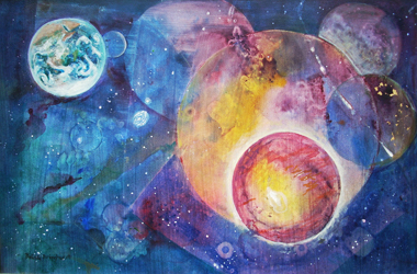
| Belinda Bringhurst - 5.2009 
|
Belinda, you've done a very important thing here, which is, you've taken elements from assignments and turned them into your own composition. It's so important in artwork to be able to do that. I like your careful placement of circles, and the variety of sizes. I like your use of repeated shapes to create rhythm. I like how you've used textures to create interest in the painting. The earth stands out to me as being clear and detailed. I'm wondering if you might want to have other areas that are clear and detailed to balance out the composition. Or, if you want the earth to stand out as the only clear and detailed element, I wonder if you might want to place it more centrally located in the composition. As it is, it draws the eye to the upper left hand corner and hardly lets the eye leave. What do you think? Again, I'm quite impressed at your adaptation of an assignment to make it a work of art. Keep up the good work, Belinda!
|
|
| |
|
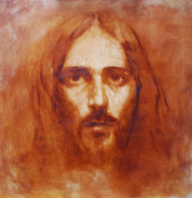
| Matthew Grant - 4.1.2009 

|
Matthew, these are great sketches! I love the painterliness of both of them. I like how you have used background shapes to provide color and interest to the portrait of your daughter. I like how you've repeated the warm coral color of the background throughout your daughters face, and how you left the warm browns in the lower right corner of the portrait. They all work together to unify the picture color-wise. I love the monochromatic nature of the Christ portrait. It shows how much you can do with very little color variation. I think the next step here would be to add a cool color that harmonizes well with the warm you've already got. Well done!
|
|
| |
|
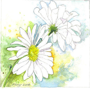
| Katy Cowley - 12.20.2008 
|
Hi Katy! This is beautiful! Is is simple and perfect. I've noticed with my own work that often the simple compositions turn out the best. I love you you've placed blues and greens in multiple areas to move the eye around. I also love how there are a few dark accents that move the eye through the composition. I'm curious about your reference. Were you looking at a photo? |
|
| |
|
| Jennifer Prince - 12.2.2008 
|
Jennifer, this is exciting to see! You are tackling some grand themes and I'm excited to see where these will go in the future. As we get further into paint application, color theory, and figure structure, I think these will get better and better. Good job! |
|
| |
|
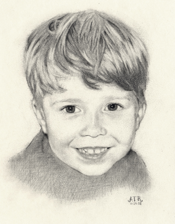
| Amy Tolk Richards - 10.31.2008 
|
Good job Amy! I especially like how there are a few dark accents to move the eye throughout the drawing. Also, good control of the soft and hard edges. The next thing we want to conquer with these is how you are going to integrate marks that are more abstract or sketchy with more finished areas in order to create more variety and also help you finish these faster. Congratulations on another great drawing! |
|
|
|
|

