 | |
|
 |
COLOR HARMONIES/
FIVE CIRCLES + 7
Assignment D.C.2.3


|
Directions: Start by collecting five photos. These can be pictures you took years ago, they can be magazine cut-outs, or you can go out and take some new photos. The essential thing is that the photos contain color harmonies that you absolutely love. I've included a photo here as an example. It's a photo I took over two years ago, but I remembered it because I love the color harmonies. Just like certain musical notes that sound good together, certain colors have an aesthetic harmony when placed side by side. In the picture of my children, the muted creamy green sets off beautifully the pink and peach-yellow flesh tones. Also, the little touch of blue in the jeans and the bright pink bow give the picture just the touch of accent it needs. Proportions are essential to harmony. Once you have your five photos, save them. Continue to notice beautiful color harmonies when you see them, and set them aside for later use. Now let's go back to your five circle exercise. We want to add seven more circles. It will be practically impossible to add seven more circles without having equidistant lengths here and there, but try to make each distance unique, and try to avoid eye traps (like the one I accidentally made in the upper left corner of my example to the left. Pick one of your five photos, and let's make a painting. I'd prefer that you do this with acrylic paint, if possible, but I'm open to other options. This painting's largest dimension should be at least 11 inches. Make a copy of your drawing and trace it onto your panel or canvas. Your panel or canvas should have a very smooth surface. If you have questions about how to accomplish this, let me know. Now, mix your colors and paint the circles. They can have different colors on the overlap if you want. They can merge with background colors if you want. There are two important things: 1. The colors should reflect the colors in your photo, both in hue, value, and in proportion to the composition as a whole. 2. The edges should be as perfect as possible. You will need a good sable brush to accomplish these hard, geometric edges. Save this painting, because we will be doing more to it later. When you are finished with your composition, email me a scan or photograph. |
|
| Katy Cowley - 1.10.09 Katy, you're painting is similar to Jennifer's in that I love your painting! I love the color harmonies. I love your colors and composition. I love how you've taken the IDEA of the colors and made them your own.
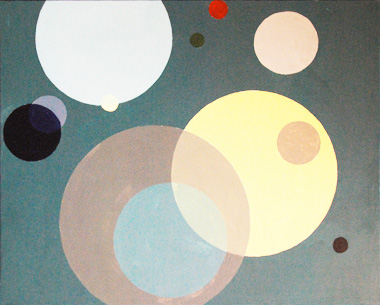
Just like Jennifer's, there is a significant value difference between your painting and the photo. (Perhaps it's just the scan you sent. I know it's hard to get a good scan of a painting.) I took the liberty of posting a lighter version of your painting below--one that I feel is similar in value to your reference photo. (Of course this throws the actual colors off and desaturates them.) My point is that, one of the disciplines I am trying to get across here is using the same colors in the same ratios as they are in your reference photo. Again, for purposes of this assignment, you have done a wonderful job and there is no need to fix anything. Next time we do a similar assignment, I want your colors to more accurately reflect the colors of your reference photo (in every aspect--lightness, darkness, warmth, intensity, etc). Let me know if you have questions about that. |  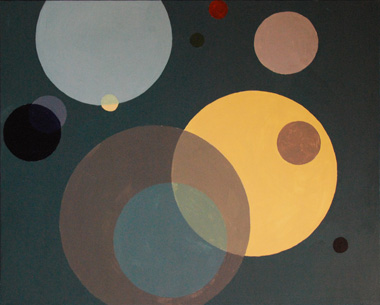 |
  |
| Jennifer Prince - 11.20.08 First let me say how much I like Jennifer's painting. I love the color harmonies. Jennifer has used very little intense color here, and when she does use it (the bright red and yellow) it is placed strategically for accented focal points in the composition. Jennifer, you have done a fine job for purposes of this assignment. You have taken colors from a photo and made them your own. We will do something very similar next month, and I'm going to ask you to do two things differently next time. First of all, I want you to paint on a smoother surface. You can accomplish this by scraping a layer of gesso with a wide putty knife over your canvas like butter over bread. Let it dry and lightly sand it down. Repeat the process until your canvas is smooth. The second thing I want you to do differently next time is to have your colors more accurately reflect the colors of the photo you choose. For example, if I squint at your photo, the dominant color I see is a yellowish green--which really isn't represented in your painting. I actually like the painting colors better than the photo colors--but the discipline I am trying to get you to develop here is to see color harmonies (and the ratio in which they are used) in nature and to accurately reproduce them in a work of art. If you have questions about what I'm saying here, call me or email me. | 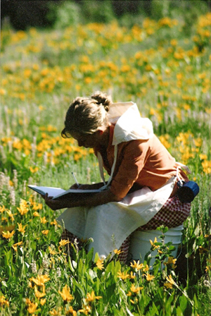 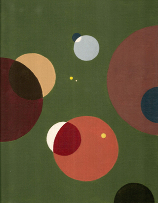 |
|
|
|

