 | |
|
 |
| |
|
YOUR OWN THING
Assignment I.V.2.3
 |
Directions: For this assignment, you should feel free to do anything you want in terms of approach and subject matter. The only thing I ask is that you do something simple and small enough that you can finish it in one month. Use materials that you already have--whether it be a pencil drawing, an acrylic painting, a collage, an oil painting--or invest in materials you will use regularly. This artwork should be something that you would do on your own--something representative of the direction in which your own art is going, or a possible direction in which you would like your art to go. THE ONLY DIFFERENCE between this month's and last month's assignment is: you should incorporate at least one thing you learned last month into this month's work of art. My info:
801.763.1602
jkirk@jkirkrichards.com When you are finished with your artwork, or if at anytime you are stuck and don't know how to proceed, email me a scan or photograph and we will post it on this page for discussion. |
|
| |
|
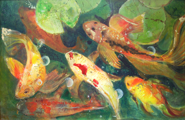
| Belinda Bringhurst - 5.2009 
|
Belinda, good job on this painting! I love how you've used repeated shapes of various sizes to create rhythm in this painting. The placement of the lily pads is especially great. I also like how you've placed a strong red accent in one place, to create a focal point for the painting. I also like how you've made the lower fishes less distinct. You can feel the "atmospheric perspective" as the water gets deeper. That's so great! If I had one wish it would be that the fish on the upper right had some of the bright yellow in it's right fin that the other two yellow fish have. That would create a triangle of yellow that would make for wonderful eye movement in the painting. Good job, Belinda! |
|
| |
|
| Katy Cowley - 2.24.2009 

| Katy, these are fun. I like how you've divided the space up into simple, flat shapes. I also like how you've created rhythm by repeating shapes with variation. These would make really good enormous paintings. I don't know how big they are, but I can imagine them being seven feet tall in a crisp, clean modern space. Next time you do a painting like this, I'd love to see you add in a second color for accent--perhaps a complementary color: 
If you could find a way in incorporate a color harmony into the focal points of these monochromatic pieces, I think they could become especially strong. Good job! |
|
| |
|
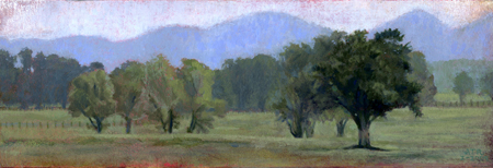
| Amy Tolk Richards - 1.17.2009 
|
Amy, I'm very proud of you for finishing this little landscape, which represents your first landscape, your first finished oil painting, the first time you've gone out and taken your own photos and turned them into your own composition. I love how the reds bleed through and make the painting warm. I love the combination of atmosphere and select detailed focal points. I'm excited to see your next painting and for you to become more and more confident and independent as an artist. |
|
| |
|
| Jennifer Prince - 12.29.2008 
|
I love how Jennifer took a photo and turned it into her own composition. She expanded the width of the rectangle and made her own beautiful scenic surroundings. The photo reference gave this picture just the touch of realism it needed. Also, Jennifer built up thick textures of paint in the foreground to give the painting a relief sculptural feel. The careful placement of yellow accents creates really good eye movement throughout the painting. Very nice! I'm not sure what to tell you in terms of constructive criticism. I think I might be tempted to put a bit of red in the trees and sky to give them a slight violet hue, which would complement the yellow hue of the rest of the painting and give the whole painting a warmer feel. This might also be accomplished by using a very thin purple glaze, like we did at the demo. |
|
| |
|
| Jennifer Prince - 12.10.2008 
|
Here's another one from Jennifer. This looks great! I'm not an expert on mural painting, but it looks like you've done a wonderful job here! |
|
| |
| Matt Grant - 7.21.2009  
|
|
|
|
|
|

