 | |
|
 |
| |
|
FOUR SKETCHES
Assignment I.V.2.4
|
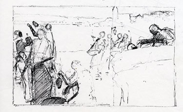
Directions: For this assignment, do four different compositional sketches for works that you would do on your own--something representative of the direction in which your own art is going, or a possible direction in which you would like your art to go. Don't spend a lot of time with detail. Focus on general shapes and how they fit into the rectangle. The image on your left is an example of how I do sketches, and you can click here to see more on my website. You can certainly do it a different way. Notice all of the lines I drew, just trying to find which ones work best. Keep working on the sketch until you are happy with it. Use an eraser if you must! Or just leave the extra lines like I do. You can also separate the sketch into light and shadow. If you get stuck, give me a call or email. 801.763.1602
jkirk@jkirkrichards.com When you are finished with your sketches, send me a scan or a photo. Including this month and last month, you should now have a total of eight compositional sketches. |
|
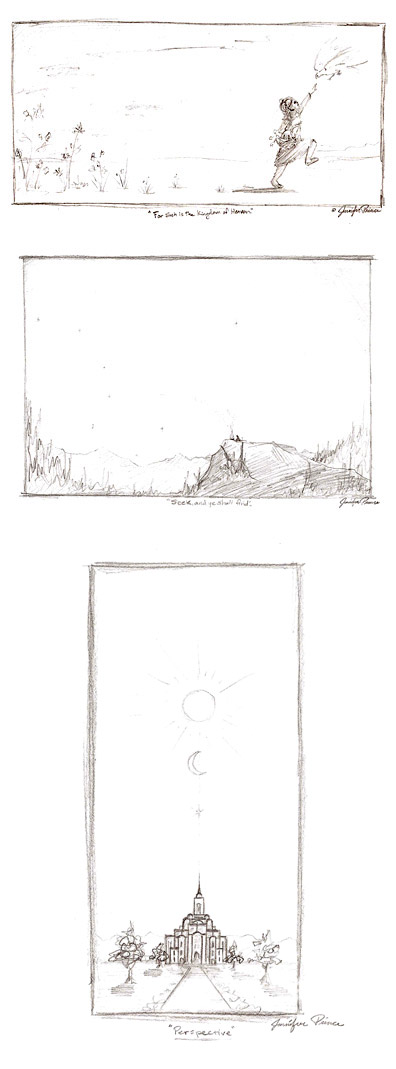
| Jennifer Prince - 1.6.09 
| Jennifer,
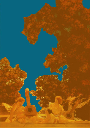
I especially like the symmetry in the bottom composition, "Perspective". I think that's going to be beautiful. There is a lot of possibility in the other two compositions also. It's hard to tell from the sketches what the eye paths will be in the final painting. Jennifer, you are a competent draftswoman, and you've got some great paintings under your belt. I think composition is the thing we really need to work on. Take a look at this Maxfield Parrish image: 
See how the composition is created not so much by the figures in the foreground, but by the blue sky that breaks through beautifully shaped tree branches. 
Jennifer, I want you to think about shapes. How are you placing shapes within the rectangle? How are you going to make these shapes beautiful? How are you going to use color and contrast to move the eye through the painting? In the end, you want your painting to have a strong general composition, so from across the room it will look great! (Great simplified shapes.) Then, as you get closer to the painting, the smaller shapes should also be beautiful. So, from a macro scale to a micro scale, your painting is full of beautiful shapes. Does this make sense? On your next bunch of sketches, I want you to find ways to break up the rectangle with beautiful shapes. |
|
|
|

