 | |
|
 |
| |
|
YOUR OWN THING
Assignment I.V.4.6
 |
Directions: For this assignment, you should feel free to do anything you want in terms of approach and subject matter. The only thing I ask is that you do something simple and small enough that you can finish it in one month. Use materials that you already have--whether it be a pencil drawing, an acrylic painting, a collage, an oil painting--or invest in materials you will use regularly. This artwork should be something that you would do on your own--something representative of the direction in which your own art is going, or a possible direction in which you would like your art to go. You should incorporate at least one thing you learned last month into this month's work of art, AND LET ME KNOW what that one thing is when you send your image. My info:
801.763.1602
jkirk@jkirkrichards.com When you are finished with your artwork, or if at anytime you are stuck and don't know how to proceed, email me a scan or photograph and we will post it on this page for discussion. |
|
| |
|
| Jennifer Paget - 8.25.2009 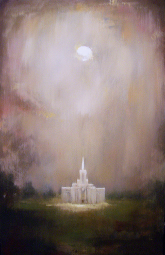
|
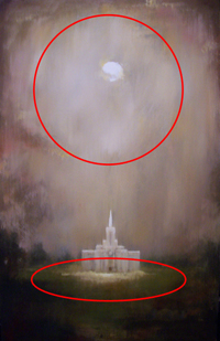
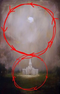
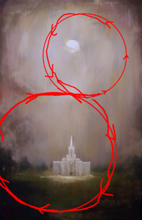
In my opinion, the new version (on the left) is a million times better than the previous version (on the right).
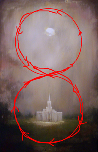
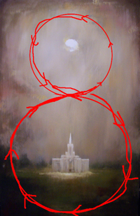
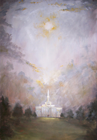 I love the feel of atmosphere in the new one. I love the careful placement of warms, and that the whole painting is warmer. I love how the darks at the bottom of the composition keep the viewers' eyes contained and moving inside the rectangle. (There may be a wide audience of people who are scared of the dark and might not like how dark this is at the bottom, but it it really brings out the light of the sun and of the temple.) It's beautiful. I love the abstraction of the trees. The new temple is less detailed, and fits in better to the overall composition. The bright highlights and few hard edges give the composition just the right amount of focal point. The brush strokes are no longer distracting. Good job! I like how the upper circle of the composition is reflected in a perspectived circle below. (See figure to the left.) The repetition of shapes but from a different perspective is an interesting idea. I love that the painting has a figure 8 eyepath. To me, the two circles of the figure 8 seem to be the same size. For future reference, it might work better to have different sized volumes in your eyepath. Though, it might be argued that your painting has different sized volumes, the top being a larger volume than the bottom. I love the symmetry of your painting. When you decide to do an asymmetrical composition, it might be nice to try a figure 8 with different sized volumes, where part of the eyepath leaves the rectangle, and the 8 is on an angle. |
|
| |
|
| Jennifer Paget - 7.6.2009 
|
Jennifer, you always do a good job. I've been looking at this painting now for a week, and I've decided I'm going to be tough on you here because I want you to make this painting into a masterpiece. First of all, I like the symmetry and the figure eight eye paths that you've established here. The main problem with the eye path is that it is too obvious, especially the clouds that jut into the center of the painting from the upper left side of the painting. Don't eliminate them or move them, just make them more subtle. They are doing the right thing, but too strongly. This painting is a PERFECT opportunity to explore the SUBLIME through atmospheric perspective. When I'm looking at this painting, I want to feel the air and the light in a good way. Scroll Down and look at the landscape by Mike Workman and the color field by Mark Rothko. These two paintings share the same careful atmospheric dither of color that I'd love to see you emulate in your painting. Use bigger brushes to create softer edges. Use fan brushes to create softer edges. When you're done with a painting session, gently caress your canvas with a dry fan brush so the sheen of the paint surface all moves in one direction, preferable diagonally up to the right. I can see a mess of paint surface sheens on your painting here. Don't let us see that--it calls attention to the surface, and we want to get lost in the illusion you're creating here. Be more subtle about your warms. I agree with you that you should put yellow in your whites to warm them up, but be more subtle. Make your cool sky warmer, and tone down your intense yellow. Bring the warmth down into the foreground. Instead of a drab green make it dither with warmth. Scroll down and look at the careful positioning of warms in the detail from my painting "Stand of Trees." Look at how Odd Nerdrum uses color in his painting of the resurrection. You asked about putting more detail in the temple. I wouldn't. Make it softer. See if you can make this painting as strongly abstract as a Rothko painting without losing the representational forms of the temple and horizon. |
|
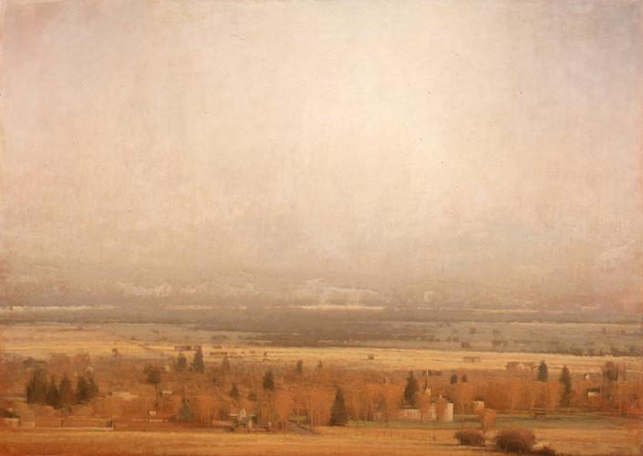
by Michael Workman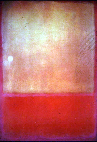
by Mark Rothko
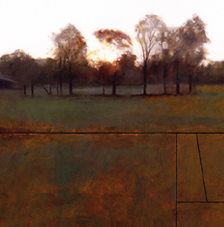
detail by J. Kirk Richards
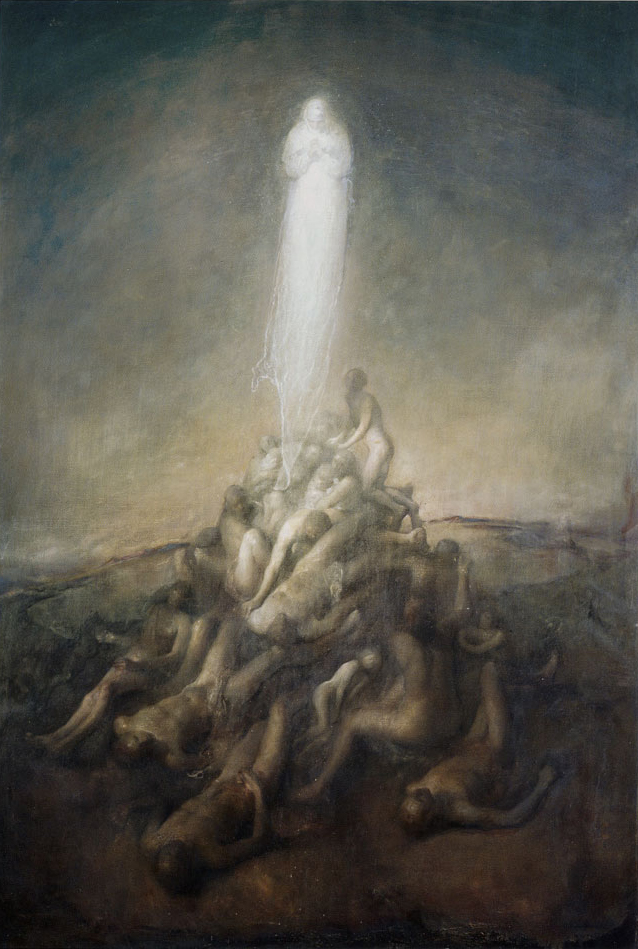
by Odd Nerdrum
|
|
|
|
|

